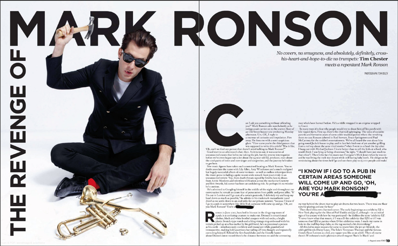
Analysing a Magazine Double Page Spread
TASK: Print out the example above and stick it into your books.
On the next page, identify and label the codes and conventions of this magazine article. Explain underneath your labels why you think the editor has made these decisions; try to think deeply.
Below is a list of all the codes and conventions you may find in the above article.
Masthead – The name and logo of the magazine.
The Lead – the introductory paragraph of an article. Usually written in bold or capitals.
Body copy - refers to the text of your written articles, which should be produced as a printed presentation to accepted industry standards, e.g. correct use of language, font size, word limits etc. Usually written in columns.
Serif font – fonts like Times New Roman, or Baskerville Old Face, which have little bars (serifs) on the end of the letters.
Sans serif font – fonts like Impact, or Agency FB, which do not have little bars (serifs) on the end of the letters.
Drop Capitals – Really big letter, which start off an article.
Cross Head – Small sub-heading used to split up a large block of text.
White Space – white parts of a page other than text or pictures.
Mode Of Address – How the magazine talks to the audience.
Sell Lines – Text on the cover that helps to sell the magazine to the audience. Kerrang!’s sell line is “life is loud”.
Banners – text, which stands out because its on a coloured background.
House Style – a magazines distinctive design that distinguishes it from its competitors.
Borders – the gaps at the edges of the page.
Gutters – the gaps between the columns of text.
Leading - the space between lines of text.
Kerning - the space between letters.
Strap Lines – a smaller headline, printed above the main headline.
By-lines - name of the person who wrote the article. Picture Credits - where did the photos come from, or who took them.
Anchorage – The way in which text helps to pin down the meaning of a picture and visa versa.

Comments
Post a Comment